

Dual-Axis Combo Charts and Customized Series
Dual-Axis charts (also known as "combo charts") are often used to portray multiple values within the same chart when the values are incomparable or when the values have different scales or simple aesthetic needs.
Dual-axis charts plot data on two different y-axes called primary and secondary (one on the left and another on the right), using the same x-axis category values. These charts are different from multi-axis charts, where data is plotted on the x-axis, the y-axis and the z-axis (when appropriate), each having different data points and values.
The combo chart is particularly useful when you need to plot two or more disparate measures from the same query. Apart from being able to change the type of chart, the client will allow users to plot the different series types on two different axes. And when combined with multi-charting, the dynamic combo charting capabilities become exceptionally powerful and sophisticated without complex programming.
Chart Series Editing and Customization
Before making a combination chart, the series editing and customization functionality need to be reviewed.
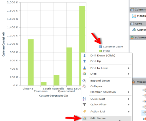
From any existing chart (single or multi) right click on any data point or on a series name in the legend of the chart.
- In the chart context menu, choose "Series Editing" and then "Edit Series"
- In the pop-up dialog you can:
- Change the chart type used for this specific series of data.
- Change its default color (as determined from the prevailing theme).
- Set which axis the series should be plotted against. Can be primary (left/bottom) or secondary (right/top).
- Decide whether the series edits should be:
- One Time - Changes maintained until the query is changed or rerun.
- Relative - Changes apply to the series which occupies this position in the series list . This approach is useful when the series list may change based on user interaction.
- Absolute - Changes apply to this particular data series (and element) ONLY. Any changes made to the underlying query that exclude this element will not reflect the new series edits.
- Order - Determines which series in the plot area will appear in front or behind which other series.
NOTE: The Chart context menu allows users to move the series to the secondary axis and move its position directly, without needing to open the Series Editor.
Creating a Combo Chart
With the Series Editor, it is possible to make a combination chart. For example, using the following steps:
| Step | Result |
|---|---|
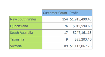
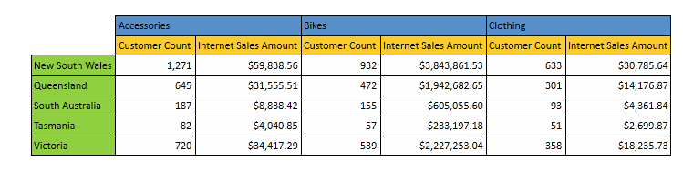
| 1. build a basic dataset with two different measures on the rows |
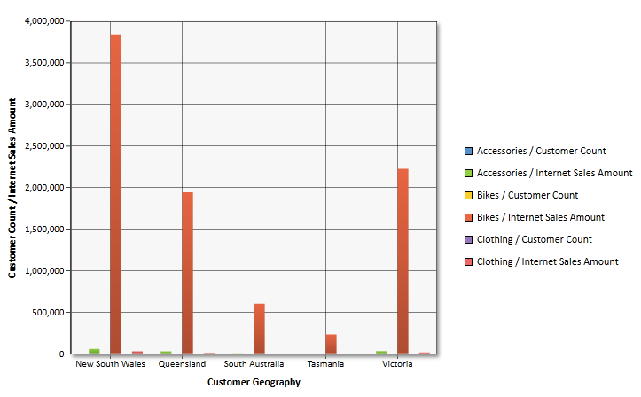
|
| Customer count does not show up in the chart. So right-click on the Customer Count value in the legend and choose "Edit Series" from the context menu. |
|
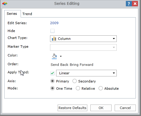
| Set the customer Count chart type to Line; change its color to red; place it on the secondary axis; and click OK. |
|
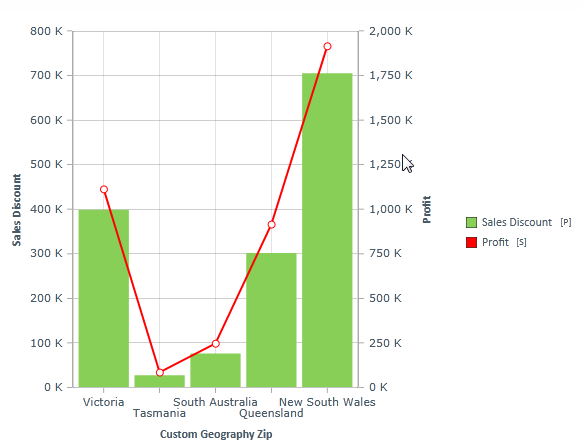
| The resulting combo chart now highlights the relationship between sales and customer count. Both metrics can also be measured properly. |
|
Multi-Combo Charts
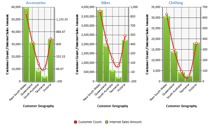
The ultimate charting capabilities of the analytic client are demonstrated through this example of multi-combo charts. Users can transform a multi-dimensional grid with a fairly useless single chart, into an extremely insightful and usable multi-chart (broken up by product) with customer count measure on the secondary axis as a Spline chart all in less than six clicks !
Home |
Table of Contents |
Index |
User Community
Pyramid Analytics © 2011-2022